Zulip
Zulip at https://zulip.com/ is a Group Chat alternative that get's a lot of things right that Slack didn't. It offers a kind of weird threaded but unthreaded model. Don't think it's my favorite, but it kind of cool at the same time.
There's a good article Source--Zulip V.S. Slack
Design Walk-through
Topic design
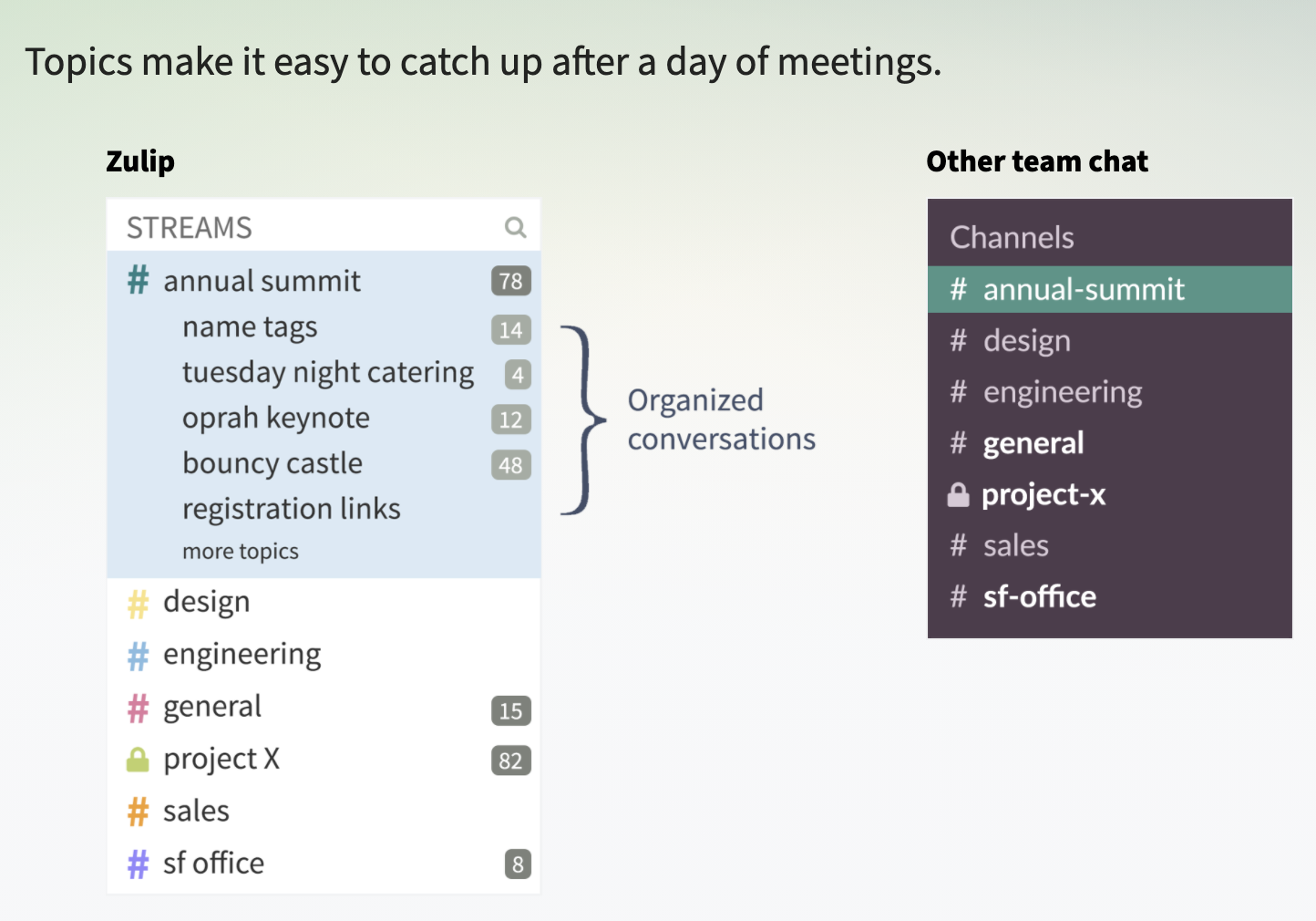
You can see topics in the sidebar pretty easily:
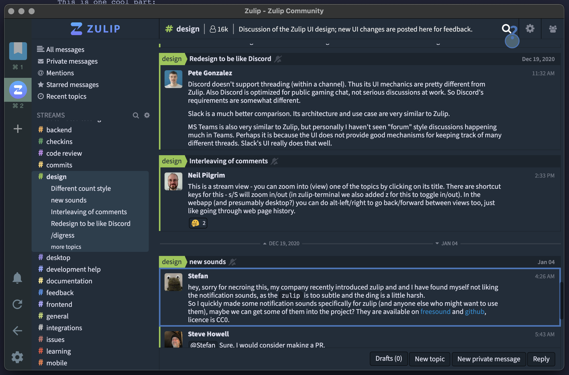
When you view a channel it looks like the picture below. Every message IS assigned to a topic, but the messages are also interweaving like normal chat.
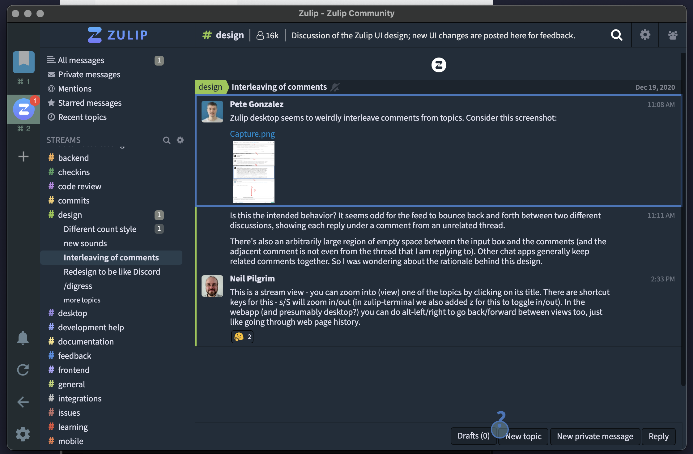
If you want to dive into a topic you can by clicking on it's title:
Replying to a message
Replying is perhaps the most weird and interesting part. When you're in a channel you have to click on a message THEN it will let you reply:
Screen Recording 2021-01-06 at 06.25.19 AM.gif 🔖
this file hasn't been written, it's a stub
Creating a new Topic
Creating a new topic looks like the image below. It immediately puts you in the topic input to help encourage that, although doesn't require it!
Screen Recording 2021-01-06 at 06.28.03 AM.gif 🔖
this file hasn't been written, it's a stub
Search
Search is very important and what should set something that sets Zulip apart from Slack due to the organized titles.
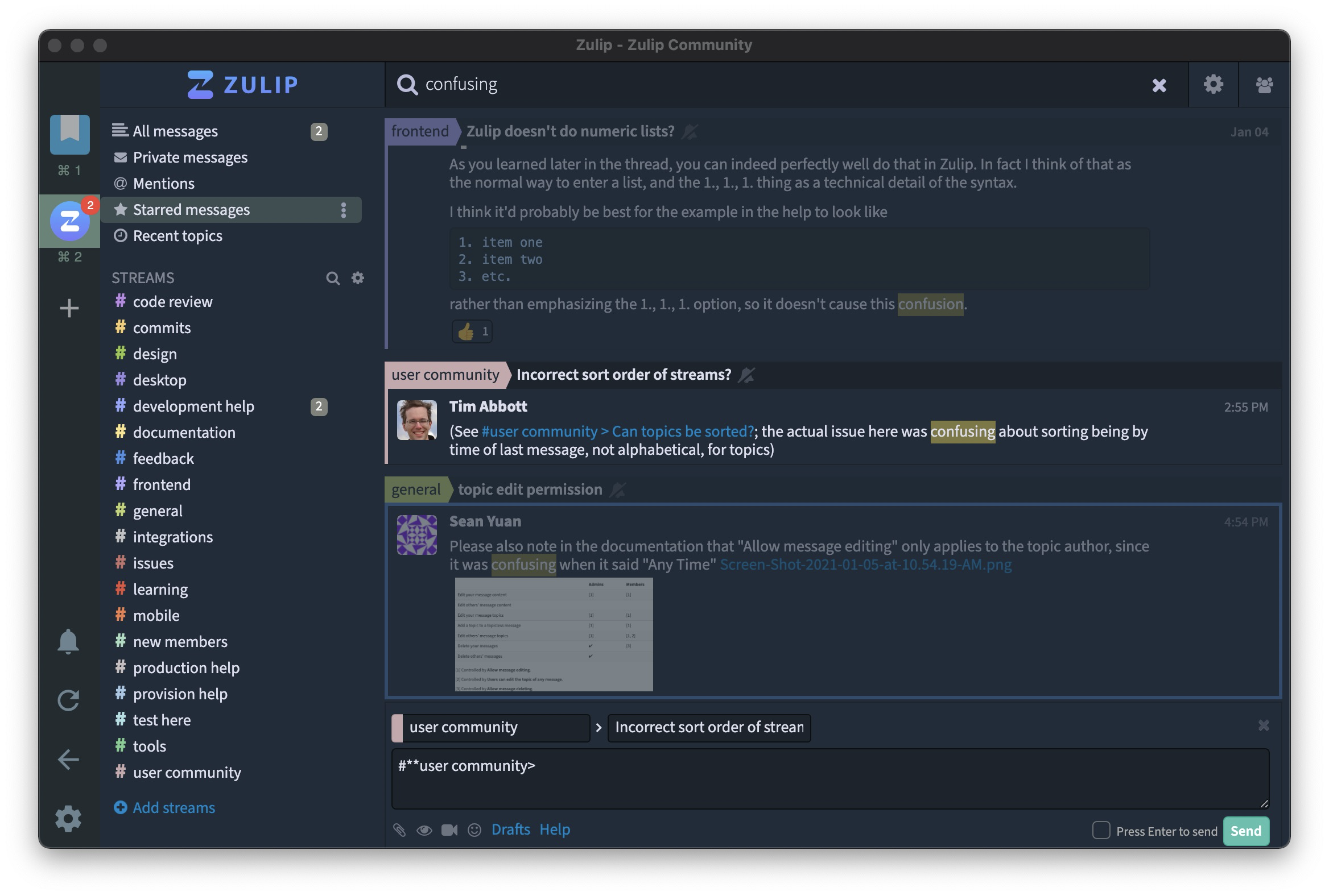
I'm pleased with this first typing into the box:

If you push enter it spins for a second (probably doing a full text search). And shows a pretty pleasing view of the results, although really just a different type of channel view.
Referencing other topics
You seem to be able to do this with the # symbol to go to channels, then > to go to different topics. Works pretty well!
Screen Recording 2021-01-06 at 06.45.51 AM.gif 🔖
this file hasn't been written, it's a stub
Topic Naming merges topics
If two topics have the same name, they merge. You can see that in this comment there was a spam thread that got started and it it kind of merged with my accidental thread.
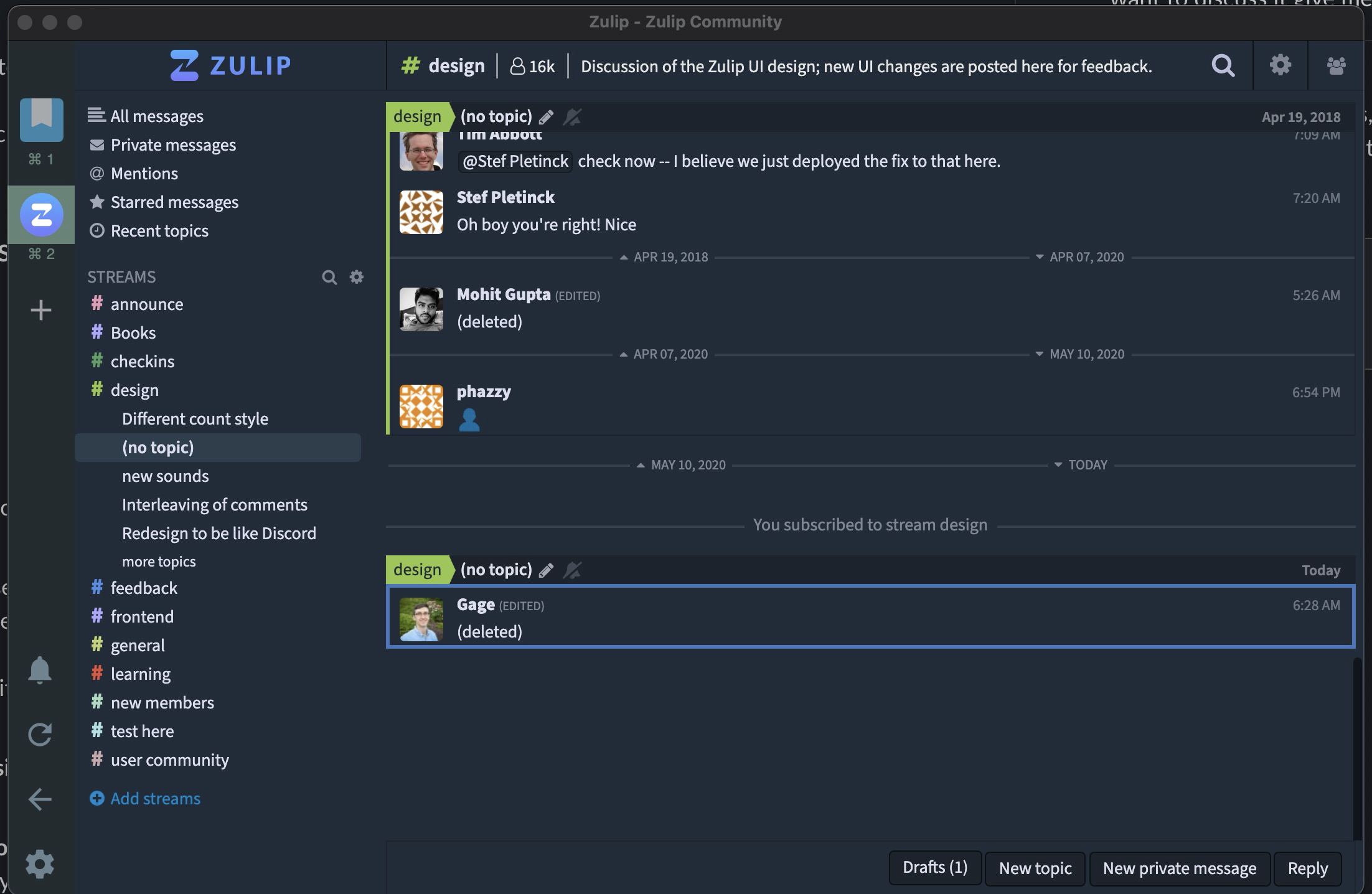
The sidebar problem
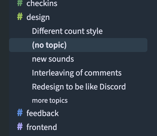
The sidebar of topics is a bit weird to me. I think it encourages duplicating topics if they've happened over a long period of time, although the merging kind of helps with this, but that's only if you name it the exact same.
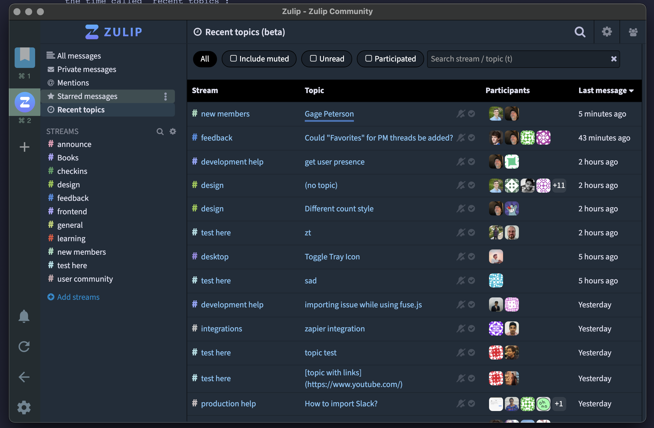
However there is one more view that is actually what I really want all the time called "recent topics":
My Thoughts
Overall I find the "see messages at any level" model a lot more confusing and less calm then something like Basecamp's message boards. Also it does seem that Zulip does still does still encourage reading every message, although it's easier to write off topics as uninteresting. Overall it's a very nice Open source alternative to something like Twist!
Other stuff
This is one cool part, they handle unread bankruptcy pretty well here!

Backlinks: