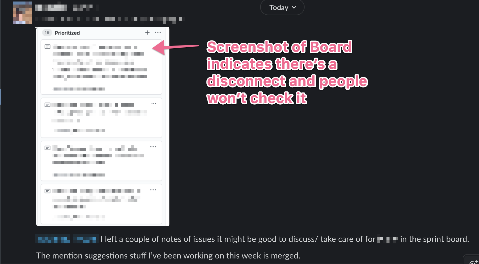
2020-11-20T1211 - the Value of ZOOM in Basecamp
Normal Kanban/Slack/Github Combo looks like this:
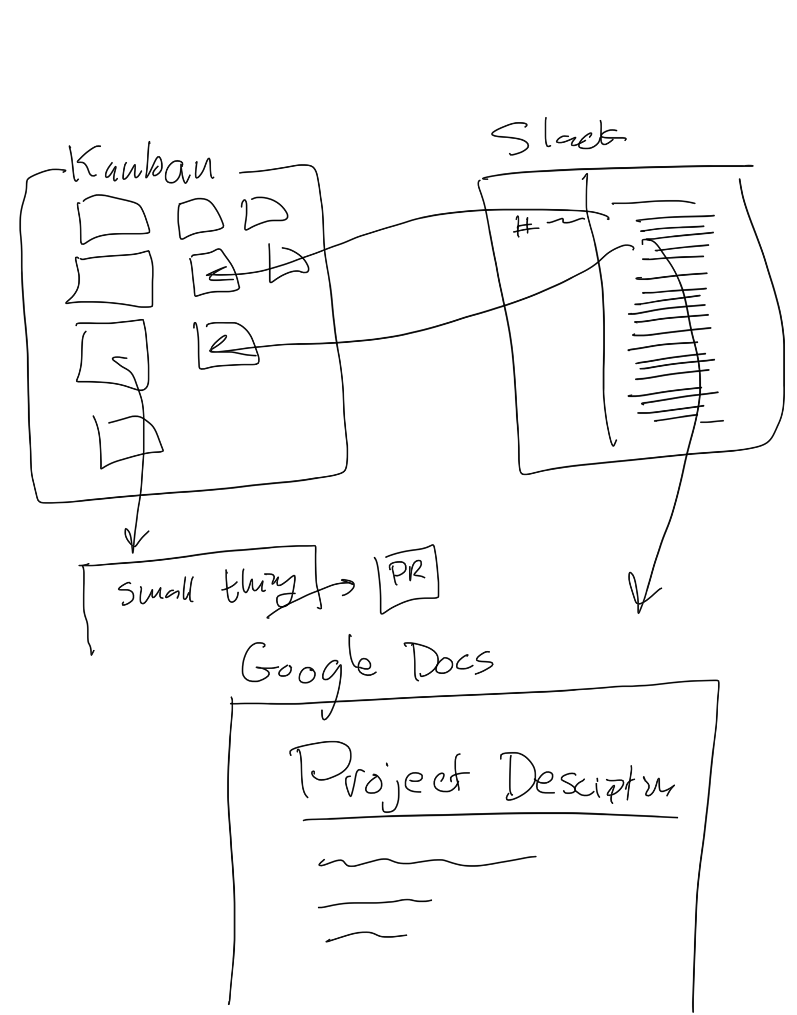
Very messy things are mostly reliant on Slack to be the Backbone of communication, which it's not very good at.
Basecamp works like you would sketch something, it starts with high level goals and slowly fills in details. This is because it's built to be used by Shape Up, which does this. You can see that in it's cover art:

Kanban doesn't work this way, it treats us like dumb ticket takers, where we don't need to see the big vision, just the individual details. It puts project description through a shreader
Example of how Basecamp Zooms
A sketch overview of how Basecamp is structured (also see Basecamp is like a Town for a more complete breakdown)
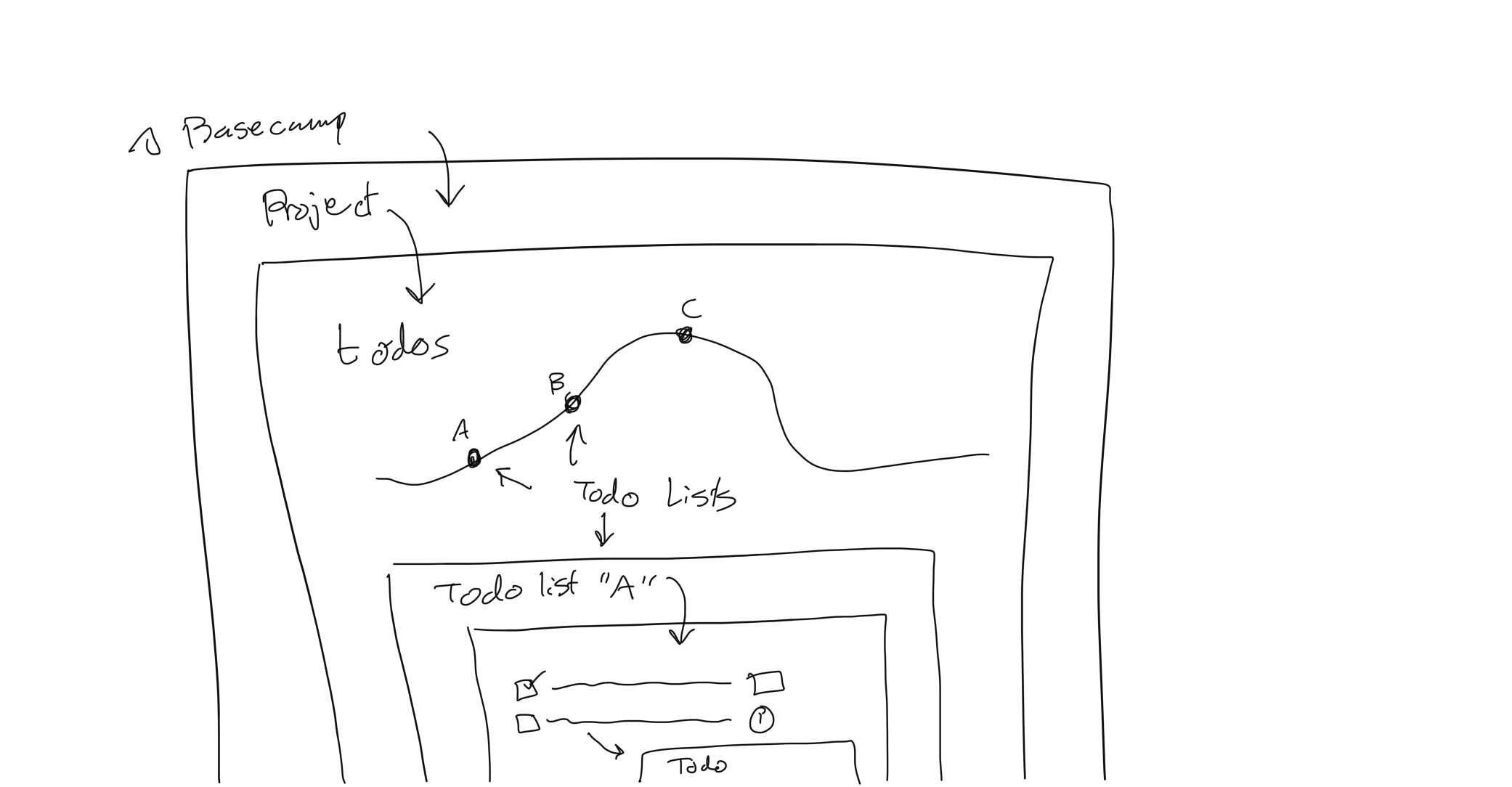
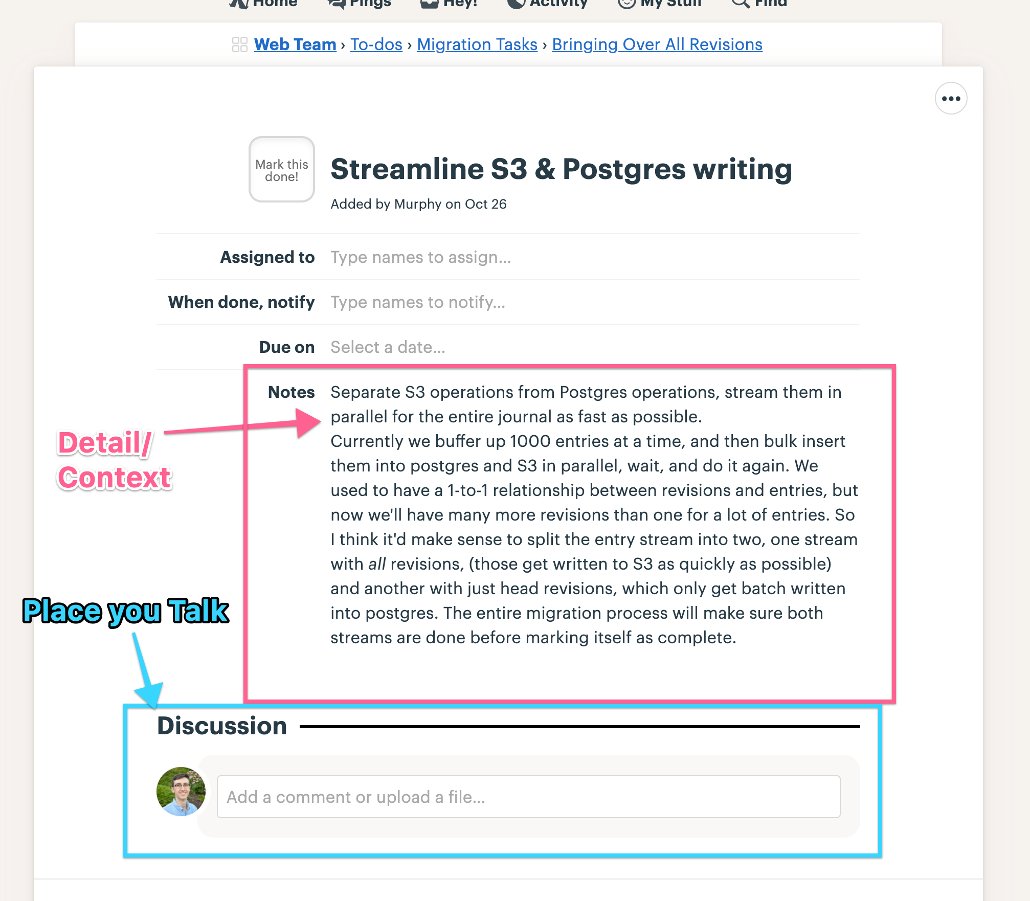
Here's a dive into one todo
(NOTE: you don't normally have to take this many clicks, just showing all the layers for illustration purposes).
Project Layer
This layer shows the whole project at a high level. The Hill Chart at the top shows how each Scope (sub-piece of the project) is close to being done.
These colored dots map to individual to-do lists below the Hill Chart.
REPLACES: Google Docs/Meetings this often is in a separate place in Kanban land, such as Google Docs, this is a very bad thing because people don't often go out of their way to make sure the project is on track. Basecamp makes this far more natural.
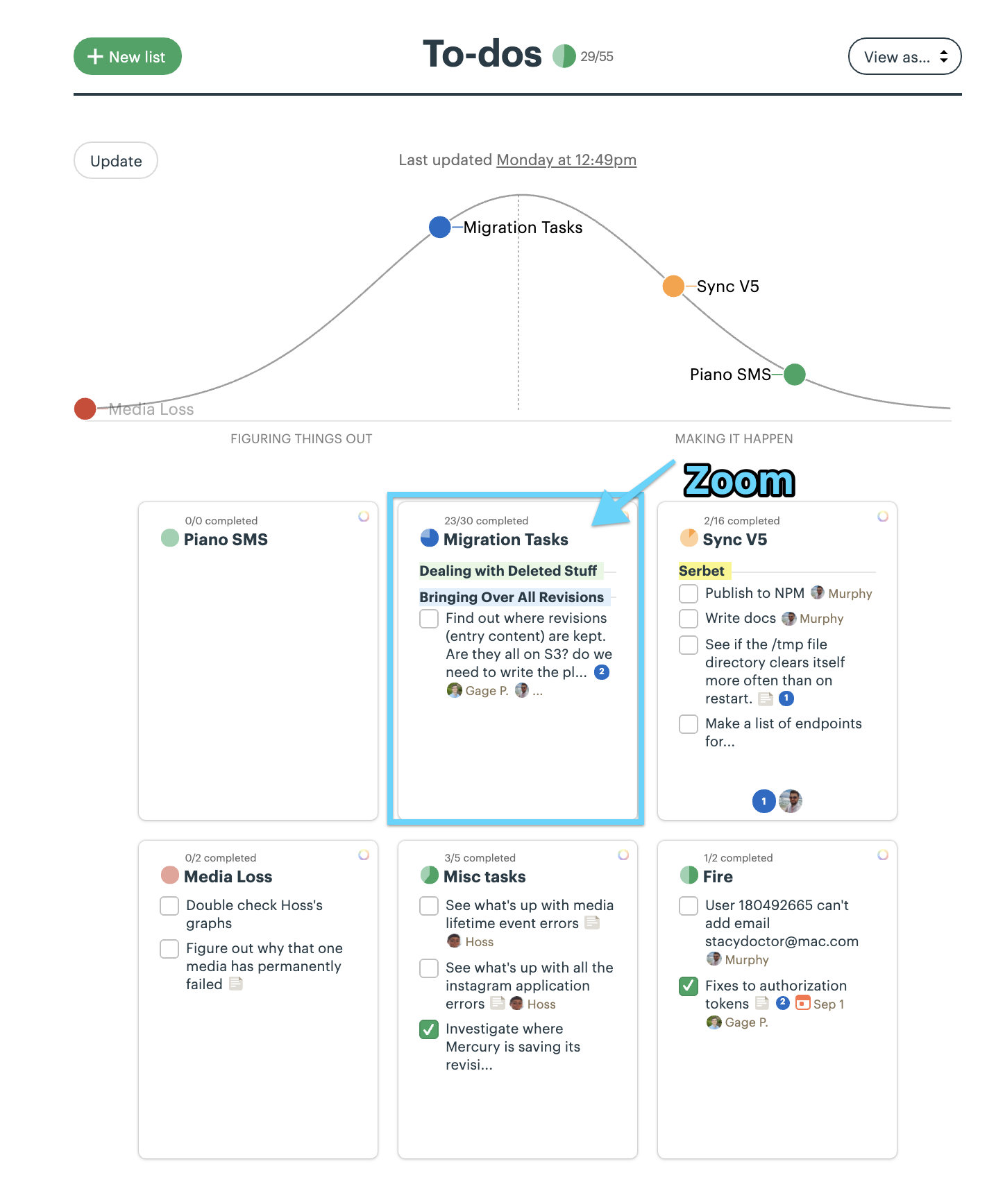
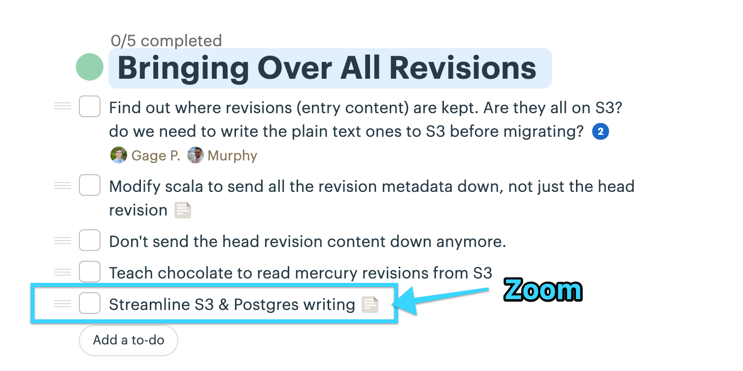
Now lets dive into a todo list:
Todo List
This shows all the individual things that need to get done:
Todo
This is where the nitty gritty stuff about this todo lives, often only the person working on it, and those helping them will go this low.
REPLACES: tons of messages in Slack where the information is impossible to link back to this project/todo. EG:
Backlinks:
