Source--Twist Designing to be less stressfull
ref: https://blog.doist.com/designing-twist-the-challenge-of-making-teamwork-less-stressful/
Design is never neutral. It feels like the apps we use every day give us all the freedom and choice in the world, but that’s never actually the case. Every option, every button, every interaction defines not only the actions that we can take, but also the actions that we want to take.
When our remote team started using Slack three years ago, we experienced the subtle but real impact that design has on behavior. From its free-flowing chat channels to its [[Source--Is Group Chat Making You Sweat#^5e1f13|one-line-at-a-time]] message composers, everything about Slack was designed to keep you communicating with your team in real-time, all the time. (It’s not surprising that the team behind Slack originally designed game apps).
link: Real-time
Was constantly responding to group chat messages the best use of our time? Of course not. But that’s what we found ourselves doing.
We identified a need for a different kind of communication tool and set about designing Twist. (You can read more about that decision here.)
Twist’s design certainly isn’t neutral either. We set out to intentionally build a tool around the values we hold as a company:
- That the thoughtful conversations that push meaningful work forward are the lifeblood of a team.
- That to be transparent, conversations not only need to be accessible to everyone, they also need to be organized in a way so that people can actually go back and find them later.
- That people need to be able to disconnect to focus on their work — or enjoy life outside of their jobs or take a vacation — without feeling like they’re missing important conversations.
- That people should be able to work from any time zone in the world on the schedule that works best for them, without being left out of important discussions.
- That work should bring fulfillment, not stress and anxiety.
We wanted to give you a transparent look into the choices we made to design Twist around those values, the issues we faced and how we solved them, and the challenges we’re still facing. Whether you’re a designer interested in building more ethical principles into your own apps, or someone interested in learning about how Twist actually evolved, we hope you’ll learn something useful.
The 3 original requirements
These remind me of pattern languages by Ryan Singer.
- One tool for all the team communication
- Mostly public communication
- Asynchronous communication
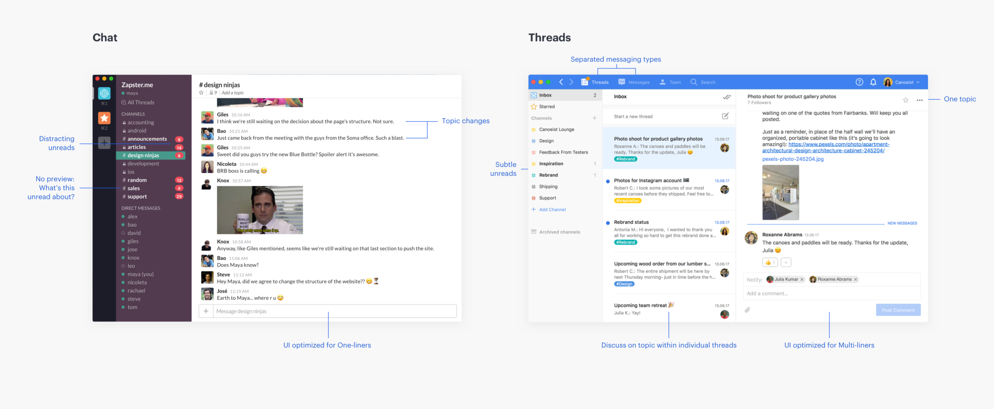
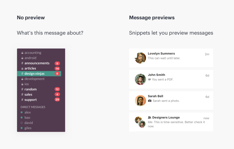
The biggest issue we had with Slack was the chat structure where multiple topics are merged into one [[Source--Is Group Chat Making You Sweat#^29a8b3|endless conversation]]. Not only was information quickly buried, but it also tied people to the app, constantly checking on new developments in a channel.
We quickly realized that older forms of digital communication — emails and forums — had actually avoided this specific problem (albeit while creating different issues of their own). Users can create a new topic/email for each conversation, give it a subject, and from that point on the discussion would stay organized and on-topic.
Also interesting how they designed even the DMs to allow to solve The mystery in your inbox (Slack's notification V.S. Basecamp):
Notifications are the main UX tool designers use to keep people coming back to their apps. For any communication app, notifications are a necessary evil, but we wanted to make sure that people using Twist would maintain as much control as possible over when they communicate.
They also talk about the "Time Off" feature and the "Chose who to notify", some features I still miss in Basecamp.
Choosing familiarity over novelty
Getting one person to adopt a new tool can be hard. Getting a whole team to adopt a new tool together all at the same time is, well, much harder. With that challenge in mind, we intentionally set out to maintain UX patterns that people are already familiar with, rather than invent new, unfamiliar ones.
This is the whole [[MAYA: Most Advanced Yet Acceptable]], thing! They are very good at this, their interface is so easy to learn for people who use Slack.
It would have been easy to let our egos get in the way and design something entirely unique, but our objective was to make it as easy as possible for teams to adopt the tool right off the bat. Twist isn’t reinventing the wheel but rather combining the most useful aspects of other tools into a single simple app.
Wow! That last line is an awesome concept.
Onboarding is an issue for any product, but the unique, longer-term payoff of holding conversations in Twist doesn’t do us any favors. New users naturally gravitate toward messages — the part of the app most like group chat — ==because it’s the easier paradigm to start using.==
On the other hand, threads require you to think more deeply and communicate more thoughtfully about a particular topic. ==It can feel more formal and intimidating==, and it’s not always clear to new users why they should use threads over messages. The “a-ha” moment is much less immediate than with group chat.
Slack provides instant gratification, this is easy to see the benefit of and hard to see the long term effects.
Links: Long-form, [[7 Habits of Highly effective People#^49b292]], Slack Addiction.
If your boss expects you to respond immediately, you don’t have a choice. No matter how thoughtfully we design the app to be mindful of people’s attention, change also requires a shift in the mindset by both users and team leaders.
This is interesting because design can only get out of your way in this situation. Yet it can't entirely save you from your habits.
In building Twist, we realized that in-app design needs to be complemented with intentionally designed experiences outside the app — in our Help Center, on our blog, in our emails, on our social media channels, in our illustrations — ==that promote a more mindful, balanced approach to teamwork==. Content design and app design need to go hand in hand.
Their site is very calming, all the illustrations are very flowy.
Backlinks: