Slack's design of it's input box V.S. Basecamp
Slack's input box is designed for short term thinking and make it as easy as possible to send messages as fast as possible (to drive engagement).
Slacks Input box
Let's break it down:
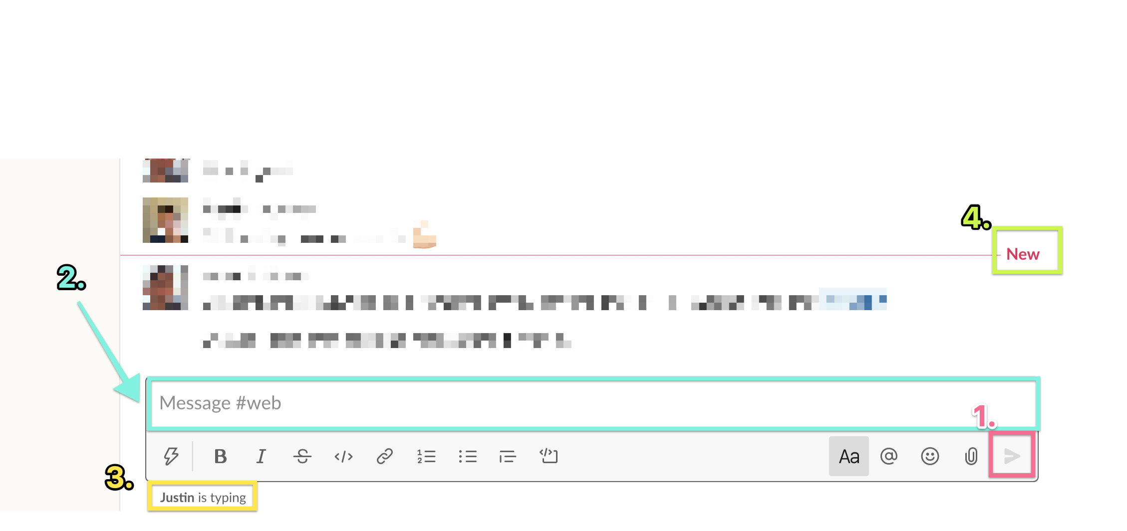
- The fact that all you have to do is push "enter" makes it faster to send rapid fire messages then send one well thought out one. It makes it hard to write multi-paragraph messages like you would normally do in email which means you have, it's basically only "super users" that realize that this is even possible.
- The size of the text box encourages you to only write a few lines of text, and at a certain point even stops growing (about 20 lines on a normal mac screen or when it starts taking up 2/3rds of the screen)
- There's an indicator when someone is about to send a message which effectively forces you to send your message before it becomes irrelevant (not helped by the fact that)
- There's new messages popping up as you're trying to send yours pushing you to rush your sending as well.
- (not highlighted) there is some formatting options for text, but there's no place for headings which are required to help make long messages make sense.
- There's no title
- Only about ~10 messages can be seen without scrolling, far less if someone posts an image (see: Slack's poor use of space)
- Images don't show inline, but always get posted above the message, this forces you to break up your message if you wanted an image in the middle which means people could interject before you have a full thought out
Basecamp's Input box(es)
Basecamp has multiple different ways and places you can write content. Let's look at the most different first, the Message board post:
Basecamp Message Board Post
If you want to write an annoucment or start a new topic then it looks like this:
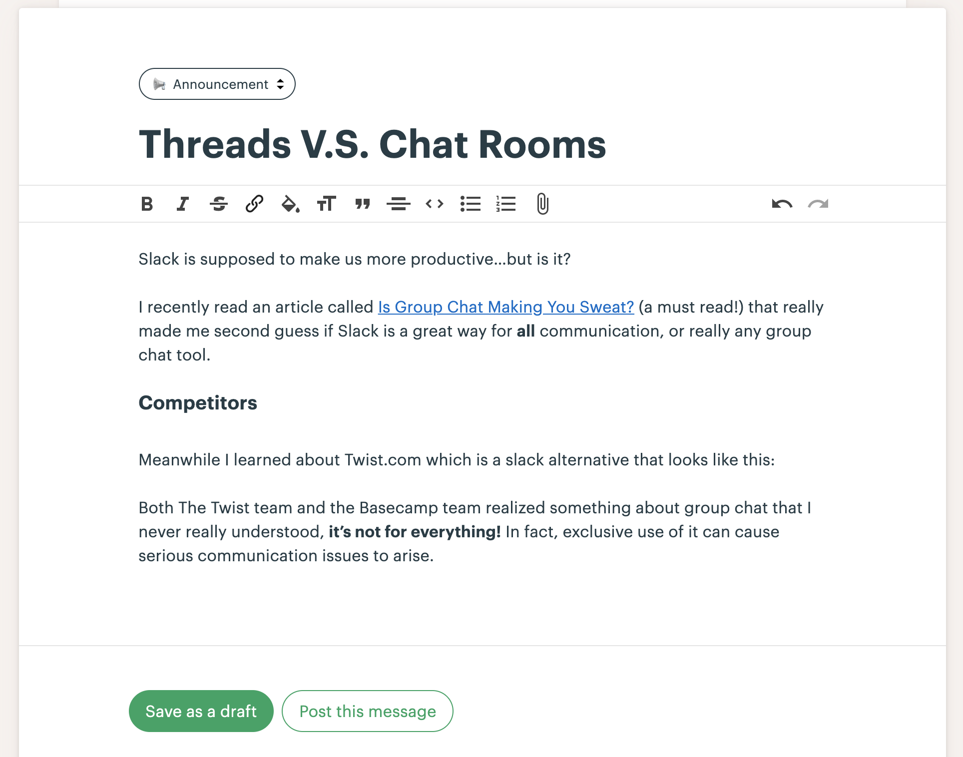
Things to note:
- It has a clear title that will be used to distinguish it and guide the discussion
- It has a full page worth of room to write out what you want
- There's no indication that other people are also writing announcements or other distractions that force you to "hurry up and post!".
- There's headers which allows you to create sections which is useful for longer posts.
- pushing "enter" doesn't send a message but do a newline, allowing for more methodical sending.
- The box grows infinitely and you never have to scroll inside a small box to see your whole message.
Basecamp Comments
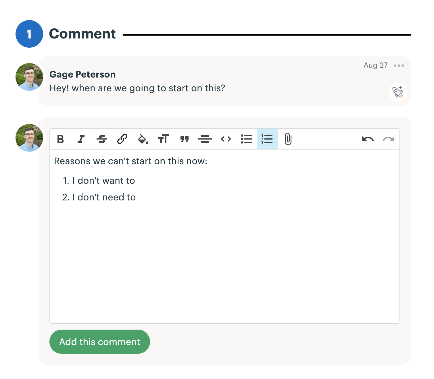 Things to note:
- The box is very big by default encouraging you to write more
- pushing enter doesn't send, but is a newline
- headers and many formatting options are available.
- Images show inline
- Other comments do show up in realtime but there's no typing indicators to rush you.
- The comment hangs off a message board post or todo with a title which scopes your comment to one discussion. This helps you get your thought out without any fear that the channel will go a different direction before you have the chance to post.
Backlinks: