fiddly
when a particular UI interaction requires lots of clicks and thought to interact with it.
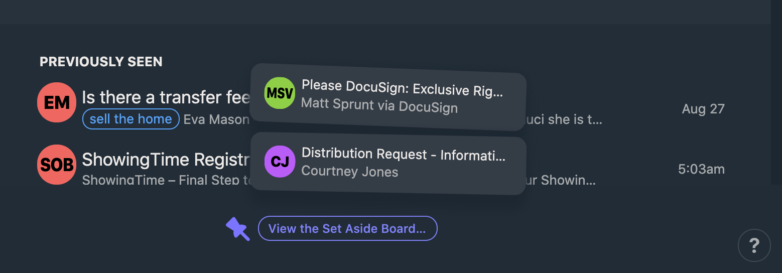
For instance in HEY! they use a simple stacking method for "later" stuff

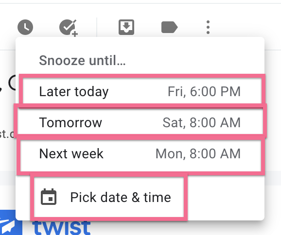
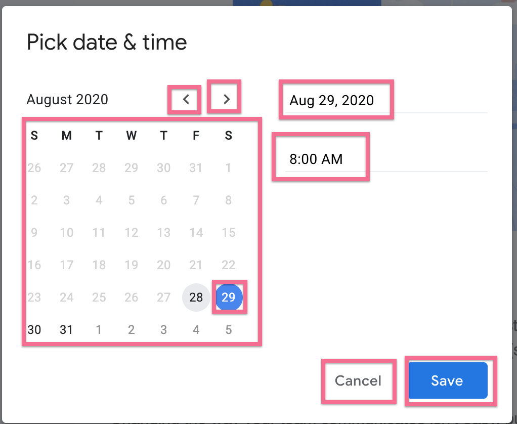
Which is less fiddly than the typical "snooze" feature most email clients have started to implement:
 initial interaction
 date picker
They Hey thing only has very simple interactions:
- I don't want to forget about this, so I'll "set it aside" (place it in the stack)
- I'm done with this email, so I'll remove it from the stack
Whereas the "snooze" feature presents you with way too many choices and gets in your face much more than necessary
- Do you want to process it today, tomorrow, someday (never), next week, or any time in the world?
- ...Email shows up
- Dang, can't look at this right now, I'll snooze it again... (loop)
Link: passive notification
Backlinks: