Github's Notification System
Github's notification system can feel overwhelming to say the least. In the below picture I've highlighted a bunch of stuff that are clickable in red, distractions in yellow. And hidden buttons and interactions in blue.
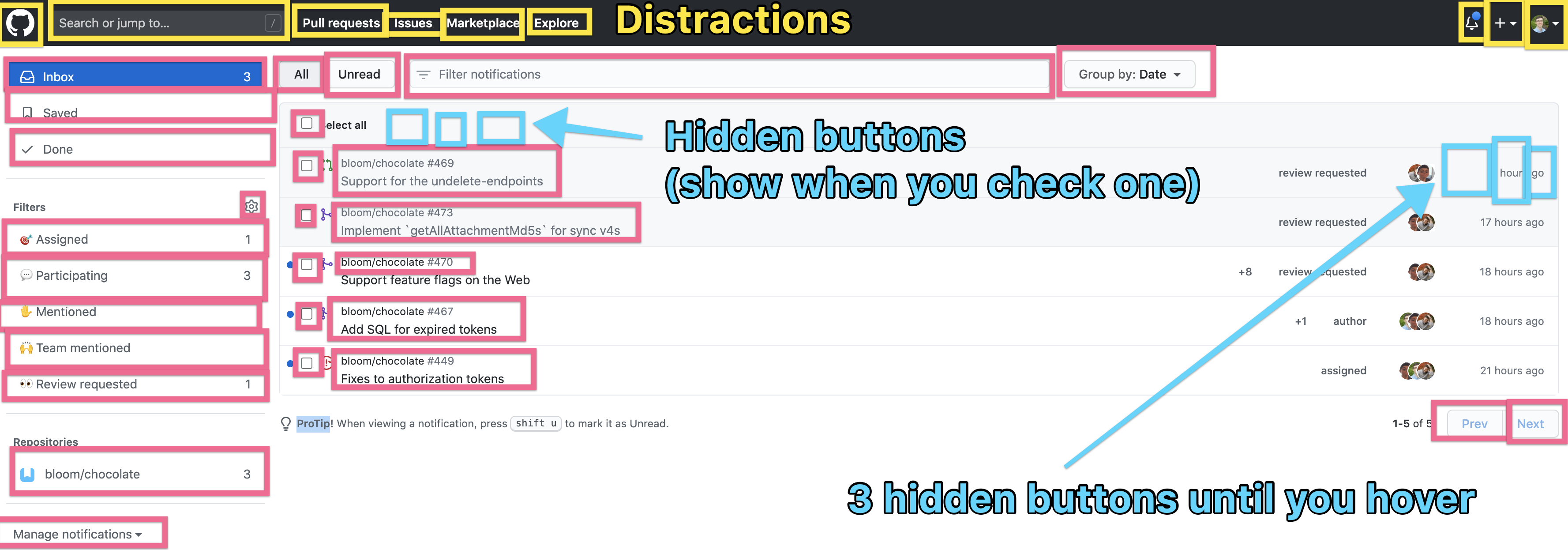
- ==27== red boxes
- ==18== blue boxes (if you include all the ones on the screen)
- ==10== yellow boxes
Score of: 45 clickable areas
How much useful information? Not much. None of these really tell you what you're going to find besides a vague statement like, "+8 review requested".
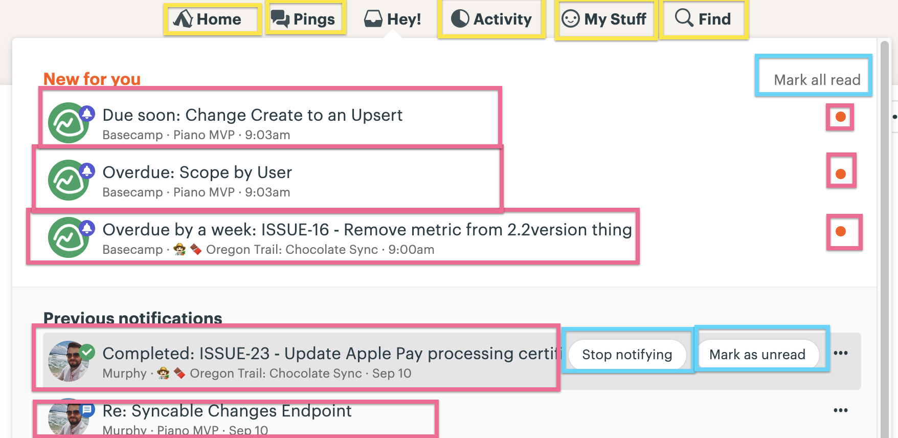
Basecamp's notification system
The mystery in your inbox (Slack's notification V.S. Basecamp) is perhaps the most simple and yet useful system I've seen anywhere.
See also: The mystery in your inbox (Slack's notification V.S. Basecamp)